Editor’s Note: Sloane Kipp interviewed Elevation as part of an undergraduate course at the University of Denver. The purpose of the course is to better understand the role that writing and research play in creating social change.
This interview helped me to expand my views on what constitutes writing for the public good. Having learned more about the work done by Elevation, I have new ideas about writing’s capacity to create change through nonprofit websites.
First, What Is Public Writing?
Writing for the public does not necessarily mean text published on paper for people to read. It can be in the form of video clips on YouTube or a website for a public awareness campaign. Confining public writing to academic journals, newspapers, and magazines would exclude thousands of platforms and their missions from the conversation of public writing.
My theory of public writing is as follows: as public works cannot be defined by a single genre, the universal meaning of writing for the public good can be defined as creating a work that clearly articulates a purpose and provides factual evidence appropriate for the genre.
In my writing course this year, my class curated exhibits that represented the goals and purpose of Elevation, using information from interviews with Elevation staff and clients. The theory I developed guided me in collecting data from the interviews conducted with Elevation’s Emily Friedrichs and Brittany Frater because I wanted to collect the most clear-cut data for the exhibit.
While interviews are less formal and calculated than experiments with data, they were perfect for the exhibit because the interviewees’ personal experiences were directly related to user experience and content writing, with additional insight from Elevation’s client, Kelly Hollimon of OurPath.
Looking for the Work in Action
User experience (UX) design is a process where teams in companies design products, specifically websites in the case of Elevation, to create helpful experiences for their users. UX writing is a subset of UX, which focuses on the actual text and information provided to guide you around the site. UX design is the placement, color scheme, and overall aesthetic of the site. Think of it this way: UX design is what color and where the button goes, UX writing is what the button says.
I selected the ASPCA website as an example to explain how organizations like Elevation use UX in their work. I chose ASPCA because I am passionate about saving animals and helping stray pets find better homes. My family has always adopted our pets from the ASPCA or from Operation Kindness in Dallas.
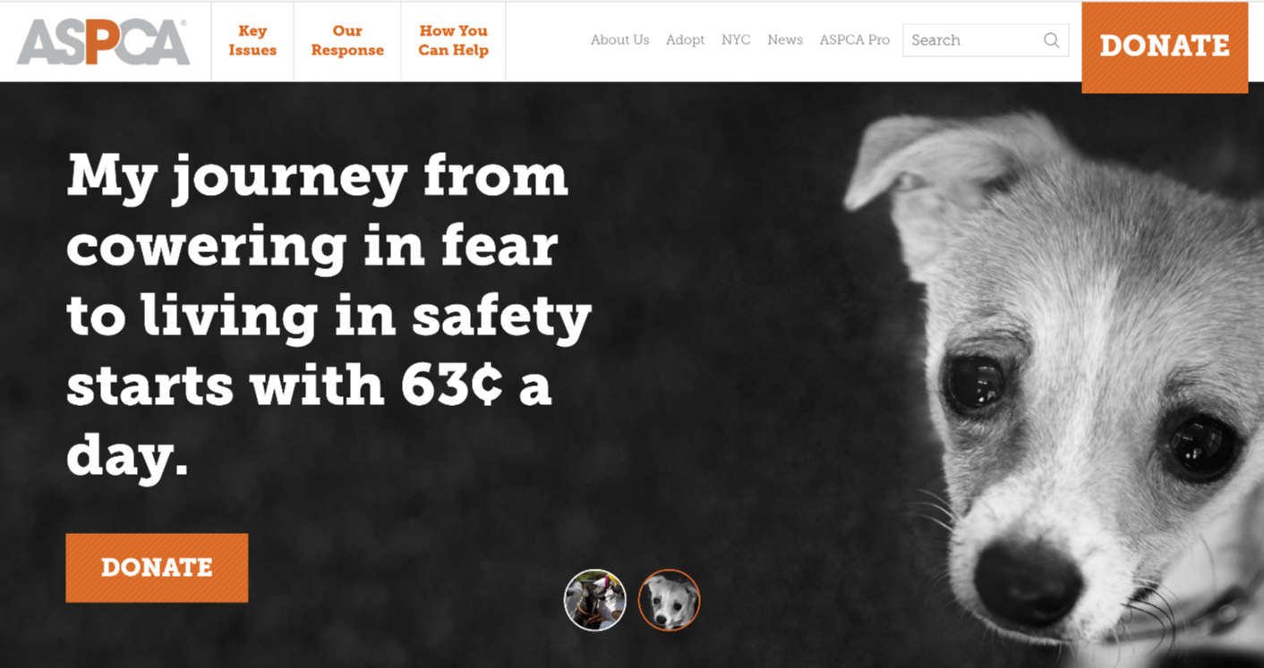
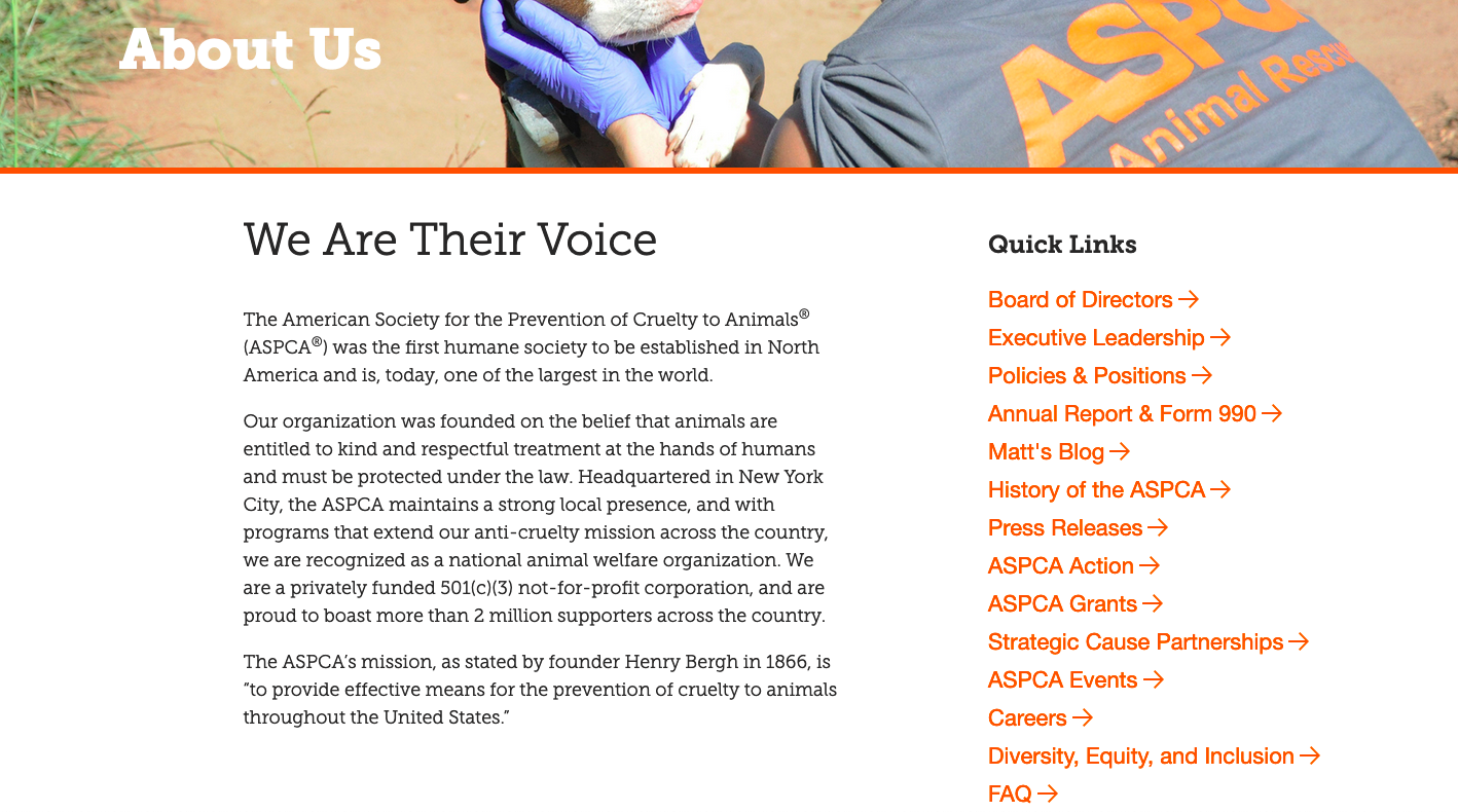
The ASPCA website represents both UX and content strategies discussed by Emily and Brittany. I will talk about UX design as related to buttons, then content strategy as related to the home page text, and, lastly, both the content and layout of the “About Us” page.
The first thing I notice after interviewing Emily and Britney is the donation buttons. The orange contrasts with the black and white layout of the rest of the page, which places emphasis on those buttons and encourages website visitors to click them.
Additionally, I am drawn to the quote on the screen from the dog’s perspective that says, “My journey from cowering in fear to living in safety starts with 63 cents a day”. This quote elicits an emotional response from the viewer, and the minimal “63 cents a day” encourages the reader to make donations since it is such a small amount.
The design of the ASPCA’s “About Us” page is the most noteworthy. They give a concise description of their purpose next to hyperlinks to other important pages. The hyperlinks are designed to make navigating the website easiest for readers, rather than putting all the information on one page and swamping the viewer.
Other aspects of the ASPCA website are notable for the design and content, but I think the “About Us” and the “Home” page were most representative of the concepts discussed by Elevation. The best part of UX is that it’s not just Elevation that does it, and it’s not just for nonprofits.
Not Just for Nonprofits
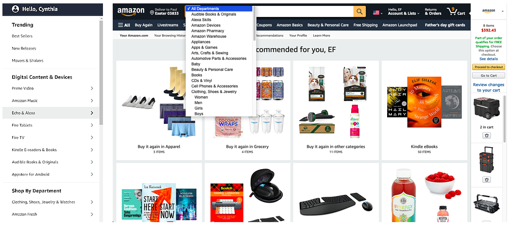
UX doesn’t just appear on websites that companies like Elevation have worked on. It is on every website imaginable. Check out a platform everybody knows: Amazon. My home page after login looks like this:
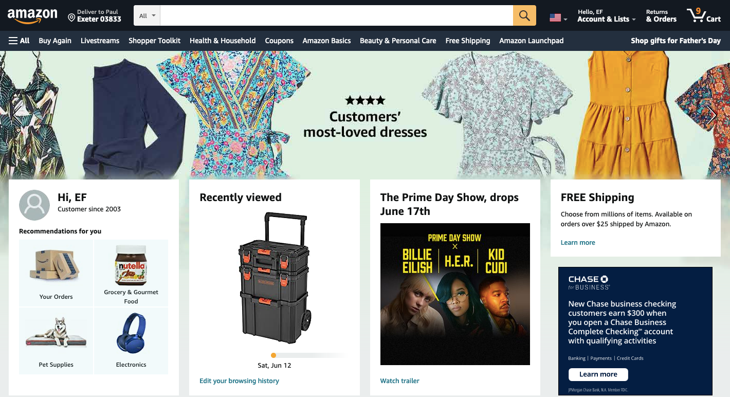
As seen below, there are several different ways to navigate the categories of Amazon’s website. The design choice to have several buttons that serve the same function of filtering shopping categories makes the shopping experience as easy and intuitive as possible.
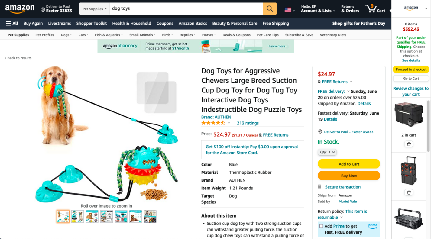
When it comes to picking an actual item, Amazon makes the process easy. Product descriptions are immediately provided, several images of the product are shown, and the purchasing process is simple with two colorful purchasing buttons.
What Did I Learn?
Elevation works for nonprofits to optimize user experience, but nonprofits are not the only place we see user experience in play. It’s on every online platform you use, and the more you know about it, the more you notice it.
Elevation is a fascinating company to me because they choose to do their work for organizations that are helping to improve the world.
What I learned through this interview is that technical aspects like content and UX support organizational goals. A site is made a published work by the details of these technical aspects. Content strategy and UX serve as the writing for the public good that helps an organization achieve its goals.

