You may have read our blog post a few weeks back that discussed 6 essential CTA tips for nonprofits. We covered a lot of ground in that post in hopes that it be a resource for organizations to create more inspiring and action-compelling CTAs. However, it’s impossible to cover all there is to know about CTAs in one blog post…not even 2 would give it justice. Therefore, what started as one post has developed into a series in efforts to give our readers the most complete package of information.
In this post, I’ll highlight 3 great CTAs from reputable nonprofits and demonstrate how they could improve. I’ll also show how the 6 tips covered in the previous post are incorporated in each of the examples listed below.
Follow along as we discuss the various elements and strategies that go into nonprofit call to actions!
Here’s a recap from our post 6 Tips to Optimize Your Nonprofit’s CTA:
- Make it clickable
- Use actionable text.
- Utilize a contrasting color palette.
- Set your priorities.
- Place it strategically.
- Take advantage of whitespace.
Case Studies
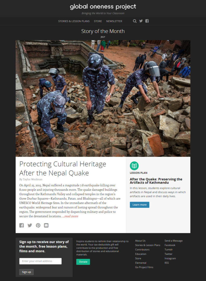
1. Global Oneness Project
Global Oneness’ homepage incorporates many note-worthy elements. Consistent color scheme and a balance between text and imagery contribute to an overall great user experience. Furthermore, the CTAs interact well with the page. Great verbiage along with contrasting colors, and a clear path make it easy to draw attention to these action icons.
However, a few small changes with the CTAs and this homepage will be top-notch. The most noticeable being prioritizing one CTA over the other. This can be done one of two ways.
1. Make one larger and with a stronger contrasting color while the other stays the same or decreases in size.
2. Place one at the beginning and one at the end. The “donate” CTA is already placed at the bottom, so place the other at the top of the fold to give the viewer more space in between each CTA. This would also allow Global Oneness to take advantage of the white space at the top providing a more distinct contrast.
Strengths
- Contrasting color
- Clickable
- Verbiage
- Whitespace
Weaknesses
- More than 1 CTA
- Placement
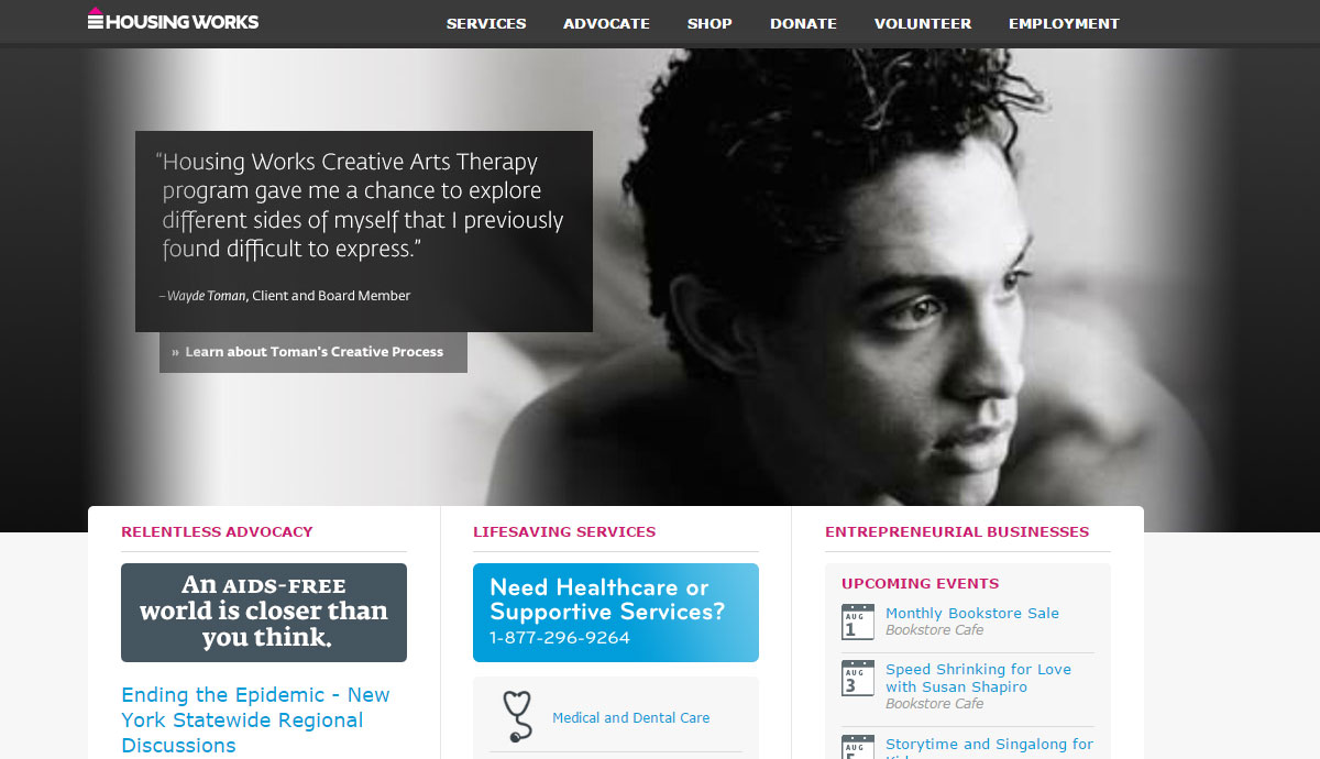
2. Housing Works
Housing Works utilizes nearly all elements of a great homepage layout. Color choice, imagery, and text compliment one another resulting in a complete and aesthetically visual home landing page. Users aren’t overwhelmed with too many Call to Actions, and they’ve taken advantage of whitespace in order to highlight the most important parts of their website.
While Housing Works’ CTA isn’t necessarily working against it, slight changes could be made in order to maximize its full potential. The first being making it clickable, which could be resolved by something as simple as contouring. Furthermore, they could use more actionable word choice to express urgency, for example, “Donate Now”, would be a great way to boost the verb choice.
Strengths
- 1 Prioritized CTA
- Contrasting Color
- Whitespace
- Logical placement
Weaknesses
- Not clickable
- Verbiage
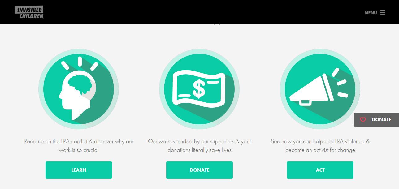
3. Invisible Children
I almost always applaud Invisible Children’s web and graphic design elements, so logically, they are highlighted in this post. Things IC does well; take advantage of whitespace, the “donate” button follows on the right side as users scroll through the page, and all CTAs are clickable. Additionally, they’ve been able to effectively use more than one CTA. Contrasting colors and logical placement demonstrate the priority of one CTA above others.
Dare I say it, I think Invisible Children could improve their CTA(s). As my own personal preference, I think that instead of using 4 CTAs (and repeating one of them), I propose that IC uses better action verbs and cuts down on the number of CTAs to 2 or 3. I also move that they increase the size of the primary CTA (Donate) in order to set it apart from the rest further distinguishing its importance.
Strengths
- Whitespace
- Location
- Button
- Effective use of 1+ CTA
Weaknesses
- Verbiage
- Size*
As reiterated from the previous blog post, you can use any combination of these elements to create a great CTA, as long as it aligns with the goals of your individual nonprofit. Furthermore, as can be seen from the above examples, some elements of a great CTA will come down to personal preference. It’s crucial to keep your mind open to the possibility of change. Test various CTAs and incorporate feedback into the planning process.
If you’re looking for some guidance, I encourage you to reach out to one of our experts today for a consultation. We offer various insights and tools that can help you plan, design, test, and implement a CTA for your nonprofit.
As always, share your thoughts! Are there any examples that we forgot?

