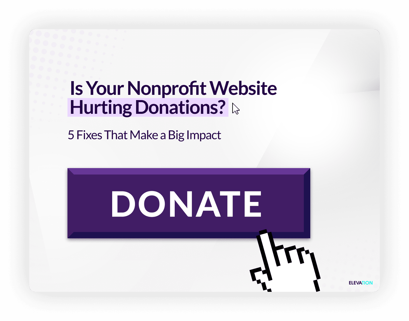
Optimize Your Nonprofit Website for Donations With Proven Strategies
When it comes to fundraising, your nonprofit’s website is one of your most powerful tools. It’s the digital face of your organization and often the first stop on the internet for potential donors. But what happens when your website unintentionally creates obstacles to giving? Slow load times, unclear messaging, or clunky donation forms can all lead to abandoned contributions.
The good news is you can identify and fix these issues to create a seamless donation experience with web design that inspires action. Below, we’ll review five impactful fixes to help you boost donations and build stronger connections with supporters.
1. Solve Common UX Problems That Disrupt Donation Flow
A poor user experience (UX) is a major reason behind abandoned donations. When visitors can’t quickly find what they need or face difficulties navigating your site, they leave without making a contribution. The key to solving this issue is simplifying and streamlining every touchpoint.
Quick Fixes
- Simplify Navigation: Use clear menus with a prominent “Donate” button visible on every page.
- Streamline Donation Forms: Eliminate unnecessary form fields and stick to the essentials, like name, email, and payment information.
- Avoid Clutter: Use clean design layouts with strategic white space and easy-to-spot calls-to-action (CTAs).
Example: The nonprofit House of Ruth redesigned its website to modernize outdated features so it could better serve donors and clients. A clear, easy-to-navigate layout was implemented to enhance their online donation functionality. Their efforts paid off with a 46% increase in online donations within the first year after launch.
2. Ensure Mobile Optimization Is Top-Notch
Did you know that over 60% of web traffic now comes from mobile devices? If your website isn’t optimized for mobile use, you’re likely losing donors. People expect fast-loading, mobile-friendly sites that are easy to browse on-the-go.
Quick Fixes
- Responsive Design: Ensure your website adjusts seamlessly to different screen sizes, from smartphones to tablets.
- Test Mobile Usability: Check that pages load quickly, forms are easy to complete, and buttons are unobstructed.
- Minimize Load Times: Compress images and use lightweight design elements to prevent slow-loading pages that frustrate visitors.
Example: Grassroots organization Malaika created a new website which also included improvements for its mobile accessibility. Their streamlined, responsive design now showcases powerful visuals and bitesize snippets that communicate its message clearly to visitors on all devices.
3. Create Clear and Compelling CTAs
A strong call-to-action (CTA) is essential for driving donations. Vague or overly complex messages can confuse or even discourage potential donors. Your CTAs need to be direct, persuasive, and action-oriented.
Quick Fixes
- Be Specific: Instead of “Support Us,” try “Donate $25 to Feed a Family Today.”
- Use Engaging Visuals: Pair CTAs with appealing images or buttons in a contrasting color that grabs attention.
- Create Urgency: Include phrases like “Act Now” or “Today Only” to inspire immediate action.
Example: BridgeUSA enhanced user engagement by incorporating bold CTAs throughout its website. For example, the website design featured prominent buttons with straightforward copy such as visible “Support Our Cause” and “Take Action” to encourage visitors to engage immediately.
4. Incorporate Trust Signals to Build Donor Confidence
For donors, giving can feel like a leap of faith. They want to know their money will be used wisely and securely. Incorporating trust signals throughout your website can reassure visitors and encourage them to donate.
Quick Fixes
- Show Transparency: Share where donations go with visuals, such as pie charts or infographics.
- Highlight Security: Display secure payment badges and SSL certificates near your donation forms.
- Add Testimonials: Include quotes or videos from beneficiaries or major donors to show the real-world impact of contributions.
- Leverage Ratings: Display your charity ratings from sites like Charity Navigator or GuideStar prominently.
Example: Take a look at the American Brain Tumor Association (ABTA) website, which was redesigned to feature testimonials, charity ratings, and transparent fund usage to build credibility. These changes contributed to a 45% increase in click-through rates on donation pages, boosting both traffic and completed donations.
5. Share Success Stories to Showcase Impact
Nothing resonates with donors more than seeing the tangible effect of their contributions. A heartfelt story combined with visuals can motivate visitors to support your cause.
Quick Fixes
- Feature Case Studies: Dedicate a section of your website to highlight donor-funded initiatives and their outcomes.
- Use Multimedia: Accompany stories with engaging photos or short videos to personalize the message.
- Update Regularly: Add fresh stories to keep your website dynamic and reflective of ongoing impact.
Example: This Is My Brave transformed its online presence by prominently featuring performers’ personal stories. Their website now highlights how storytelling events empowered individuals and reduced the stigma around mental health, generating more donations in support of these critical initiatives.

Make Donating Easy and Effective
Your website should inspire trust, make giving effortless, and highlight the incredible impact of every contribution. By addressing these five strategies, you can create an optimized donation experience that resonates with your audience and encourages action.
If you’re ready to improve your nonprofit’s website design, a design agency can provide the expertise you need to elevate your online presence and fulfill your mission more effectively.