After all your nonprofit’s hard work, how do you show it? Increasing numbers of nonprofits are utilizing data visualization to present results, successes, and accomplishments to their donors and investors. Nonprofit data visualization can effectively impact and motivate your audience, change minds and spark action.
What is Nonprofit Data Visualization?
Nonprofit data visualization is where numerical information and pictorial figures meet. They interactive data illustrations used to explain abstract concepts, help compliment fundraising efforts, and highlight where the donated funds are going.
In today’s society, numbers, data, and statistics have an important story to tell- especially within the nonprofit community. A growing number of organizations are relying on visualizations to transform the way they reach their public and improve the way they drive their mission. The key, show don’t tell.
Why is Nonprofit Data Visualization Important?
More data is being produced now than ever before leaving your nonprofit with a tough yet important task: transforming your complex numbers into easy to understand visual diagrams.
It is crucial to effectively communicate your nonprofit’s progress and outcomes. Whether it be your nonprofit’s event results, member demographic, donor giving patterns, etc. visualizing your data will help draw conclusions in an easy- to- read manner.
The numbers alone just don’t cut it these days. If visualized data is used correctly it is the perfect way to engage your audience while successfully getting your point across.
Overall Tips to Keep in Mind:
- Keep it Simple: Think about how you can break down the data in a well-organized manner, making it easy for your readers to follow while providing them with the information that truly matters. You want the information displayed to catch the reader’s attention, be concise, and continue engagement throughout.
- Aesthetically Pleasing: Use a simple color palette that is attractive to the eye. Be selective with the colors, icons, fonts, and images you decide to use as you want to make sure they directly relate to the information displayed and don’t distract the reader. If the design gets in the way of your nonprofit data visualization, it is not doing its job.
- Be Honest: The numerical information provided in your visuals should be pure and original. Although you are trying to further your nonprofit’s cause do not twist, alter, or leave out important data.
Ways to Use Data Visualization:
- Launch an awesome campaign: Create a visual that is shareworthy. You want your public to get involved as well as get their network involved.
- Provide updates on a fundraising efforts/ events: Keep your donors motivated. Show them the tremendous impact of their contributions to receive continuous support in the future.
- Express a problem: Explain to your audience the problem your nonprofit is trying to solve. Give facts and figures that will catch supporters attention.
- Share a human interest narrative: This taps into the pathos approach, appealing to your viewer’s emotions. Which as we know, individuals are more likely to donate, share, and take action when they are emotionally aroused.
- A year in review: Use this space to visualize your annual report- the transformations, efforts, donations, events, etc. Ditch the typical lengthy annual report, and get creative, ultimately getting your members to actually read it!
Your options are endless! No matter which way your nonprofit decides to use data visualization, your goal is to compel viewers to take action.
So the question is, how do you do this?
1. Infographics
Infographics are the perfect example of nonprofit data visualization. They are a great (and creative) approach to attract supporters and spread awareness for your cause. Infographics integrate words and graphics into a clear, dynamic, and fun- to- read design.
2. Timelines
Use timelines to chronologically display the history and process behind your nonprofit. Timelines provide your viewers with a captivating illustration of your organization’s progress and your hopes for the future. They are easy to follow and give your supporters an inside look as to how the need to advocate for your cause got started.
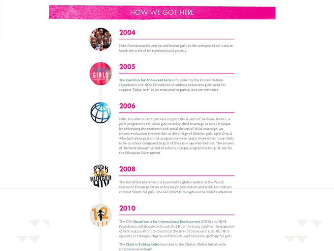 Girl Effect
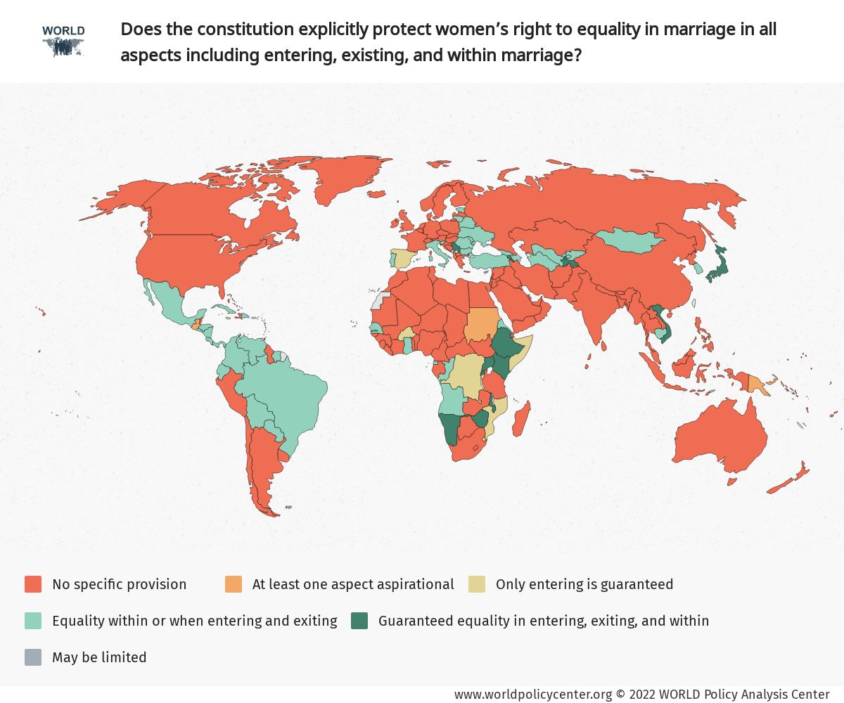
3. Maps
Maps are an extremely beneficial visual element to implement. They show where your money is going, your locations, and essentially your nonprofit’s reach. This is especially true for those organizations whose work is primarily overseas. Sometimes it is hard for your public to really understand the extent and impact their efforts have (especially when it is across the globe). With a map feature, your nonprofit is communicating and illustrating just that, the simple idea that the world is a lot smaller than we think. This, in turn, makes your mission feel more tangible.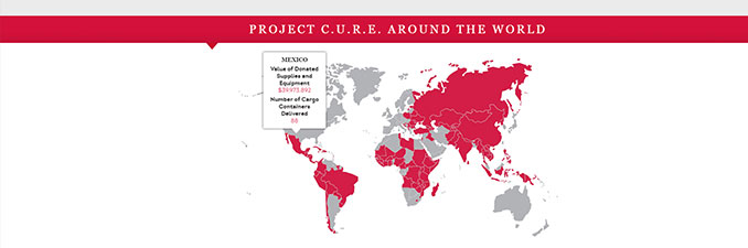
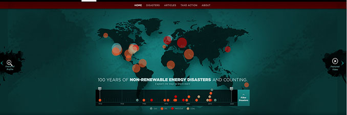 CounterSpill
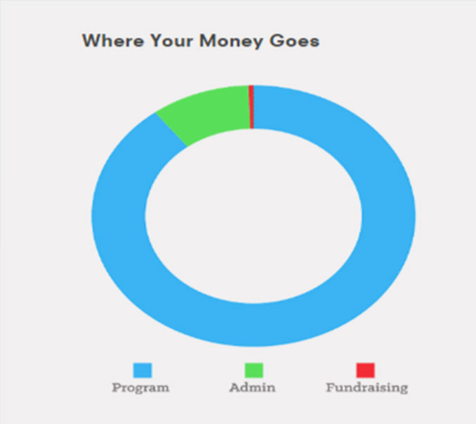
4. Graphs
Graphs are probably the most straightforward visualization approach. If your nonprofit already uses Microsoft excel, creating a graph should be a piece-of-cake. You can use graphs to demonstrate where donors funds are going, the progress of a campaign over time, the severity of a problem, and many other statistics!