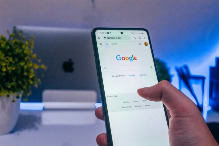

A successful donation button is easy to find, visually distinct, and clearly worded. It should stand out from the rest of the page, appear prominently in your navigation and on key pages, and use action-oriented language like “Donate.” Getting the design, placement, and wording right helps turn more website visitors into donors.
Your nonprofit’s website is the 24/7 online storefront of your organization—advertising your services, collecting donations, and raising awareness for your cause.
Within the first few seconds of exploring your page, your viewers will be judging its ease-of-use and interactiveness. A key factor in determining the effectiveness of your website is your donation button. It is imperative that your donation button is designed and positioned correctly, converting site visitors into donors.
You’d be surprised how, with a bit of thoughtfulness and attention, the aesthetics and position of your PayPal or donation button facilitate your online fundraising efforts. Here are 3 tips for donation button success that most providers support (think DonorBox, CauseVox, Classy, Snowball, iDonate, Donately).
1. Design
Once viewers have landed on your page, your nonprofit’s goal is to have them take the next step– to give. Your donation button’s design is a key player in successfully accomplishing this.
- Use highly contrasting colors: The color of your donation button is of great importance. It should stand out from the rest of the page as well as the background. You want to make sure you are drawing attention directly to the button, ensuring that your donors notice and take action.

- Pay attention to the size: The size of the objects on your web page is directly correlated with importance. In other words, the bigger the object, the more importance it holds. However, a button that is too large will overwhelm your website’s design. Therefore, when designing your nonprofit donation landing page think accordingly—how does the donation button compare in size to the rest of the elements on the page? Does it get lost in the rest of my content?
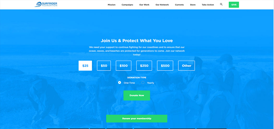
- Focus on the language: The text written on your donation button should be large, legible, and concise. You want to make sure that the language is specific and straight to the point. You want your donors to glance at the button and know exactly what will happen when it is clicked. Any hesitation may lead to fewer conversions.
2. Position
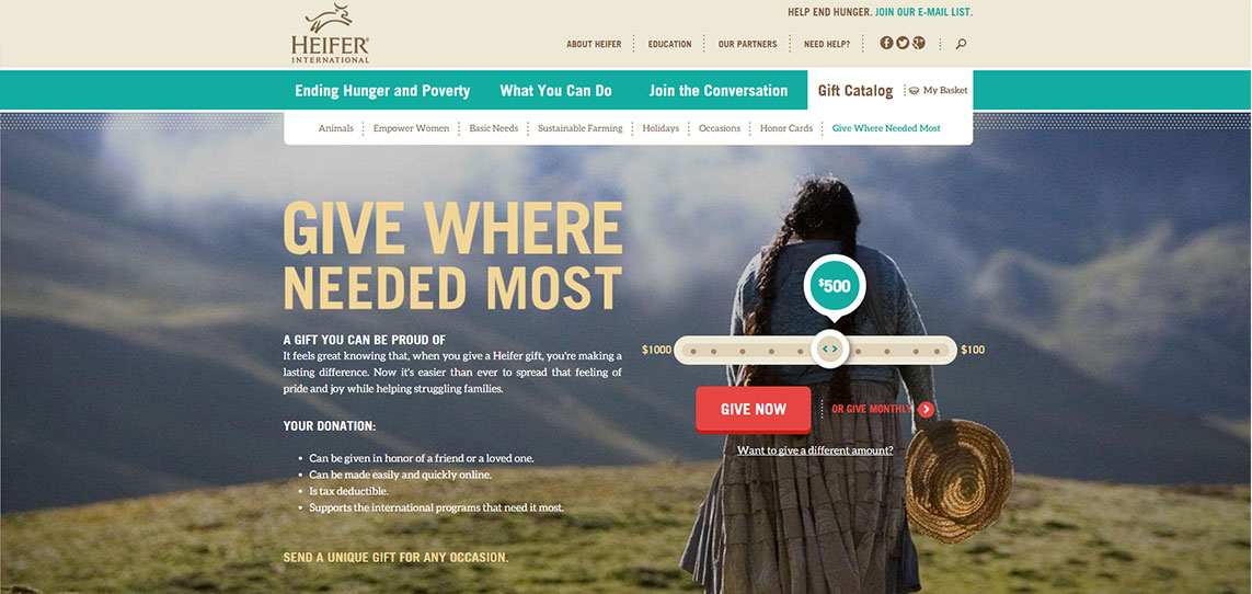
The position of the donation button on your web page is key to drawing the eyes of your supporters. Make it obvious.
- Keep it “above the fold:” The fold is the space seen on the page without scrolling. When deciding where to place your donation button, you want to make sure it is above the fold to effectively draw attention and action. This way your viewers will immediately see the option to donate, and won’t be tempted to scroll when making a donation. This location is prime.
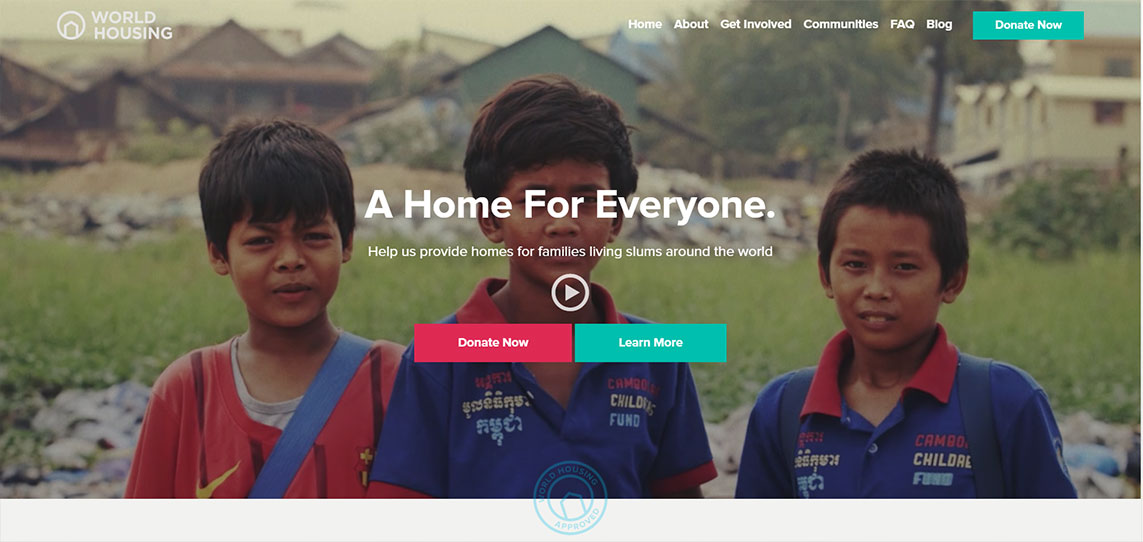
- Include it on all pages: You never know when (or on which page) your viewer will get inspired to donate. Therefore, make sure your donation button is located on every page of your nonprofit website design. This will optimize the possibilities of collecting online donations and at the same time make the giving experience easier for your donors.
3. White Space
White space refers to the blank (or dead) space that surrounds an object and/or element on your website. Although the term includes the word “white,” it does not literally mean that the actual space needs to be white. Any color works just fine (as long as there are no patterns)!
Using white space around your donation button can command attention and successfully have your donation button stand out on your website. The white space gives your page a smooth, simple look directing your new (and existing) website users to exactly where they need to go, with no distractions. This eliminates the possibility of your button getting buried or lost.
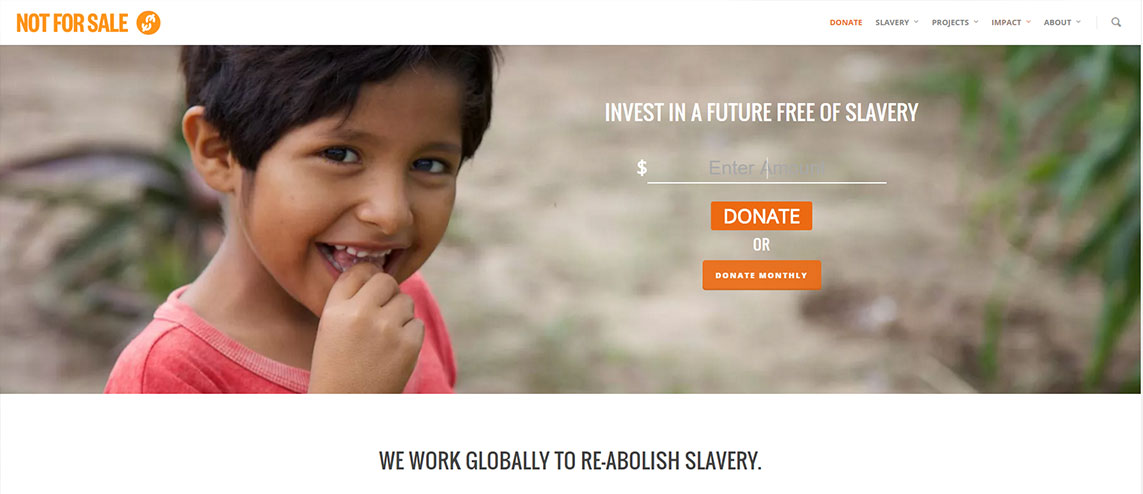
The color, location and design of your donation button are all crucial to targeting donors and increasing online donations. Take the time to focus on your donation button and you can assure your efforts will be rewarded with positive results!
For the fundamentals behind every tactic here, see our complete nonprofit fundraising guide.
Donation Button FAQs
Where should I place my donation button?
Put it where visitors expect it, typically the top right of your main navigation, and repeat it on key pages. Keeping it visible as people scroll ensures the option to give is always within reach.
What color should a donation button be?
Choose a color that contrasts with the rest of your page so the button stands out, while still fitting your brand. The goal is to draw the eye without clashing with your overall design.
What should a donation button say?
Use clear, action-oriented text like “Donate” or “Give Now.” Concise, direct wording leaves no doubt about what the button does and encourages visitors to click.
How big should a donation button be?
Make it large enough to notice easily and to tap comfortably on mobile, but not so large it overwhelms the page. It should clearly stand out as a primary action.
Can a better donation button really increase gifts?
Yes. Small improvements to a button’s visibility, placement, and wording can meaningfully lift donations. Our web design services help nonprofits optimize these conversion points.
