
1. Poor User-Experience
User-experience is one of the primary factors in creating a great website. A great user-experience is efficient, aesthetically pleasing, and easy-to-use. While this may seem like a no-brainer in the grand scheme of website design, many nonprofits fail to effectively provide a pleasant user experience for their visitors.
Here are 3 primary factors that contribute to a poor user-experience along with solutions for each.
Slow Loading Time:
Forty percent of users will abandon a site that takes more than 3 seconds to load. How can you prevent this?
-
Avoid heavy videos, photos, flash and other files.
-
Compress images using Adobe Firework or Adobe Photoshop. These tools allow you minimize the bites in graphics on your site, while maintaining the quality of the image.
Confusing Navigation:
-
Clean the layout of your page by cutting out unnecessary tabs and creating a sitemap that will provide organization to your website.
-
Simple homepage with limited CTAs, compelling photos, and a balance of text vs. imagery.
Low-Quality Content:
-
Blog articles, press releases, etc are great ways to keep content fresh and your audience engaged.
2. Is it Mobile-Friendly?
We’ve all read about Google’s updated algorithms, the most recent being Mobilgeddeon, which rewards sites for being mobile-friendly on mobile-device searches. Following this, Google then announced on May 5th that online searches take place on mobile devices more than desktops in 10 countries including the United States.
In the nonprofit world, this means that more people are searching, engaging, donating, and supporting organizations on their cell phones and tablets. Not sure if your site is responsive? Luckily, you can find that out right now.
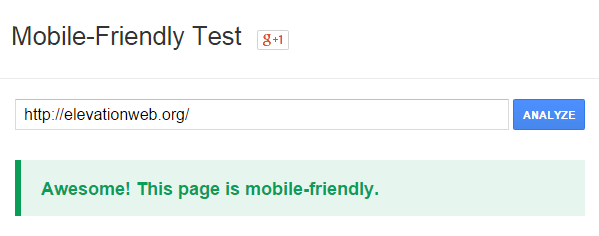
Copy and paste your organization’s URL into Google’s Mobile-Friendly Test. Google will do the work for you and give you a percentage indicating how mobile-friendly your site is along with a few resources to access for improvement.
 Eager to learn more? Check out how these 3 nonprofits are excelling in mobile-friendly web design.
3. Outdated “Look & Feel”
We live in a digital age, and more often than not, an individual’s first impression of your organization will be online. Your nonprofit’s website is a gateway to show viewers the most important aspects of your organization. Great “look & feel” should be well-kept, organized, user-friendly and inspire your visitors to take action.
While every nonprofit has its own distinct niche and audience, here are a couple of ideas that will keep your site updated, and your supporters inspired.
-
Whitespace focuses the viewer’s eye on the most important part of a website, which is usually the Call to Action.
-
Photos and Videos are a great way to relay text-heavy information through a single image.
-
Too much text can be overwhelming and steers visitors from engaging with your page. Infographics are an excellent alternative to communicate statistic-heavy information in an efficient and appealing way.
Check out our list of the top 200 nonprofit websites to learn more!
4. High Bounce Rate
High bounce rates is a fancy way of saying that people aren’t staying on your site and that more likely than not, it’s because they don’t think your information is useful. As disconcerting as that may be, if you want to see higher interaction and engagement on your site (donations, shares, etc), you may want to re-evaluate your web design and content strategy with a better idea of your target audience in mind.
Begin by defining the goals you want to accomplish with your nonprofit website. To be a source of information? To generate donations? To spread awareness? Then, start publishing high-quality content, add more links that take users to other areas of the site, and encourage visitors to share your content on their respective social media accounts.
Get the full list of helpful strategies to decrease bounce rates from Kissmetrics. And if you haven’t yet, check out Google Analytics to receive an evaluation of how your site is performing.
5. Search Engine Rankings are Low
Did you know that more than 2/3 of online experiences begin on a search engine? What does this mean for nonprofits? People are discovering and engaging with your website through Google, Bing, and Yahoo. But how can people support your organization if they can’t find your website on a search query? Properly optimizing your website on search engines can be a game changer for your nonprofit, and here’s how you can start optimizing your site, today:
-
Keep content updated and fresh by creating a blog for your nonprofit and publish articles on a consistent basis.
-
Archive previous events by creating a section of your site dedicated to past fundraisers, etc with a quick summary of their success.
-
Create inbound links that reach out to your organization’s support network. This builds up credibility in the field and encourages supporters to do the same for you!
-
Encourage supporters, volunteers, donors, etc to share your nonprofit on their social media accounts.
Conclusion
Your nonprofit website is a vital tool in effectively communicating your mission. Updating it on a consistent basis will ensure that your nonprofit’s message is being heard. Revisit this list with your team to ensure that your website is reaching its full online potential.
Or, if you’re interested updating and redesigning your website but lack the necessary resources or capacity to do so, contact one of our experts to discuss how Elevation can help redesign your website.