What makes a nonprofit website great? Unfortunately, I couldn’t answer that in one blog post. There are a myriad of elements that contribute to creating a great website and as technology advances, so must our expectations. Recently, one of the most popular topics buzzing around the website design industry is responsive web design. Responsive web design (also referred to as mobile-friendly) is an approach to web design in which sites are crafted to provide an optimal viewing experience that can be transferred across a range of devices.
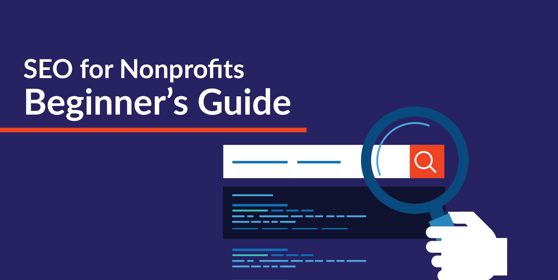
So why is this important for nonprofits? There are a multitude of benefits from having a responsive website, with some of the greatest related to how Google ranks search results. In April, Google released a new algorithm for search engine rankings that rewards sites for being mobile friendly. SEO, anyone? Following that update, on May 5th, Google announced via its blog that, “Google searches take place on mobile devices more than on computers in 10 countries including the US and Japan”. Learn more by downloading our Guide to SEO for Nonprofits.
Unfortunately, many nonprofits fall behind when it comes to mobile responsiveness. Websites that look impeccable on a desktop, but can’t be transferred to the over 500 different screen sizes out there are losing valuable online traffic. Avoid being lost amongst the lower rankings on Google and go mobile.
Check out some of the pioneers in responsive web design. We’ll discuss the various elements that each has incorporated into its desktop and mobile web design strategy.
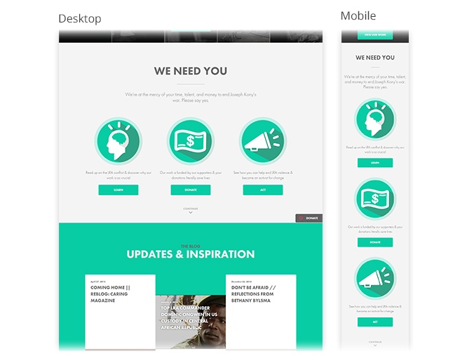
1. Charity Water
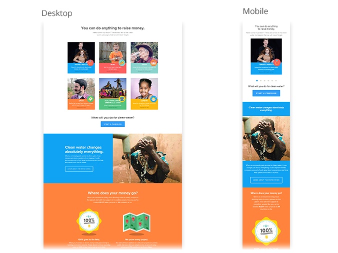
Charity Water’s website is great example of how responsive web design can be done successfully in simple and easy to maintain manner. First and foremost, the web page is transferred beautifully from desktop to mobile device thanks strategic double to single column formatting. Furthermore, Charity Water employs thought-provoking and inspiring images that can be easily transferred across different media platforms and widths. These robust, arresting images are showcased well on mobile devices thanks to simple scrolling that organizes the images effectively.
Additionally, Charity Water makes it easy for its viewers to donate by placing the Call to Action at the beginning of both the desktop and mobile device web page. User-friendly icons are organized so viewers can donate, learn, and read more without any confusion.
2. Invisible Children
Similar to Charity Water, Invisible Children’s website also employs single column formatting and simple scrolling design when opened on mobile devices. Along with these formatting elements, IC keeps the user-experience moving by providing sound bites of text that transfer across all media platforms. Short content accompanied by pleasing font sizes, color palettes, and images, ensures that users can access the most important content and in an efficient amount of time.
Unique to Invisible Children is the format of their Call to Action (CTA) on their mobile web page. The graphic design team at Invisible Children has employed the increasingly popular flat design trend with easy to understand icons that inspire, encourage, and ask their viewers to take action. Additionally, the CTA draws further attention because of a strategic use of whitespace. In web design terms, whitespace is the space in between graphics and blocks of text used to smooth things out and organize elements of a web page. Most importantly, it guides the viewer’s eye to pay attention to certain elements. Invisible Children has used whitespace to highlight the most important part of their web page, the call to action.
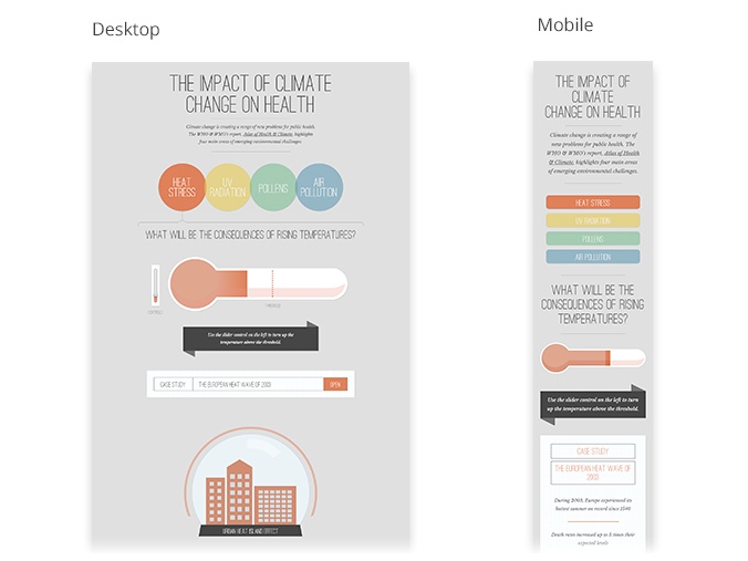
3. Under the Weather
Under the Weather’s website has exceptional infographics and an equally great execution that properly showcases them. Through innovative graphic design, UTW has made statistical-heavy information easy to understand and interesting to look at. Because these images receive a lot of positive feedback, it would be in the best interest for UTW to make these images scalable, and they’ve done just that!
Responsive images can be scaled up or down on a range of devices without having to zoom in to view the full picture. While it has become common practice for designers to incorporate responsive images into their design plan, problems still arise. One of the biggest being that when made responsive, these images often become less powerful. Thanks to great graphic design strategy, this is not the case for UTW. There infographics and images don’t lose meaning when viewed on smaller screens.
In addition to some stellar images, UTW is also excelling in navigation. An easy scroll experience that doesn’t require the user to “pinch and zoom”, action buttons that are a decent size with ample space in between them, and scalable, consistent font sizes all contribute to a user-friendly navigation experience.
Convinced?
Go mobile and avoid getting lost amongst the thousands of other pages on the internet because your audience can’t access your nonprofit’s website on their phones or tablets.
Reach out to our experts to see how we can assist you today. And as always, tell us your thoughts in the comments section. What do you think of Google’s new ranking system? What other nonprofits have succeeded in responsive web design?