After five years of growth, a website that finally tells the impact story
Mission Graduates paired brand strategy with a ground-up redesign, turning seven years of page sprawl into a clear story about students, impact, and the many ways to help.
The story
The Challenge
Five years of significant growth, powered by major grants, had outpaced a website built in 2017. Seven years of pages added ad hoc left the information architecture tangled; every donor landed on the same generic external donation page with no way to run distinct fundraising campaigns; and, most telling, an organization with a dedicated Director of Impact and real program data had none of that story represented on its site. Volunteer signup lacked warmth, the student registration path was confusing, and the brand voice had drifted. Fixing all of it became the organization’s first priority.
Our Approach
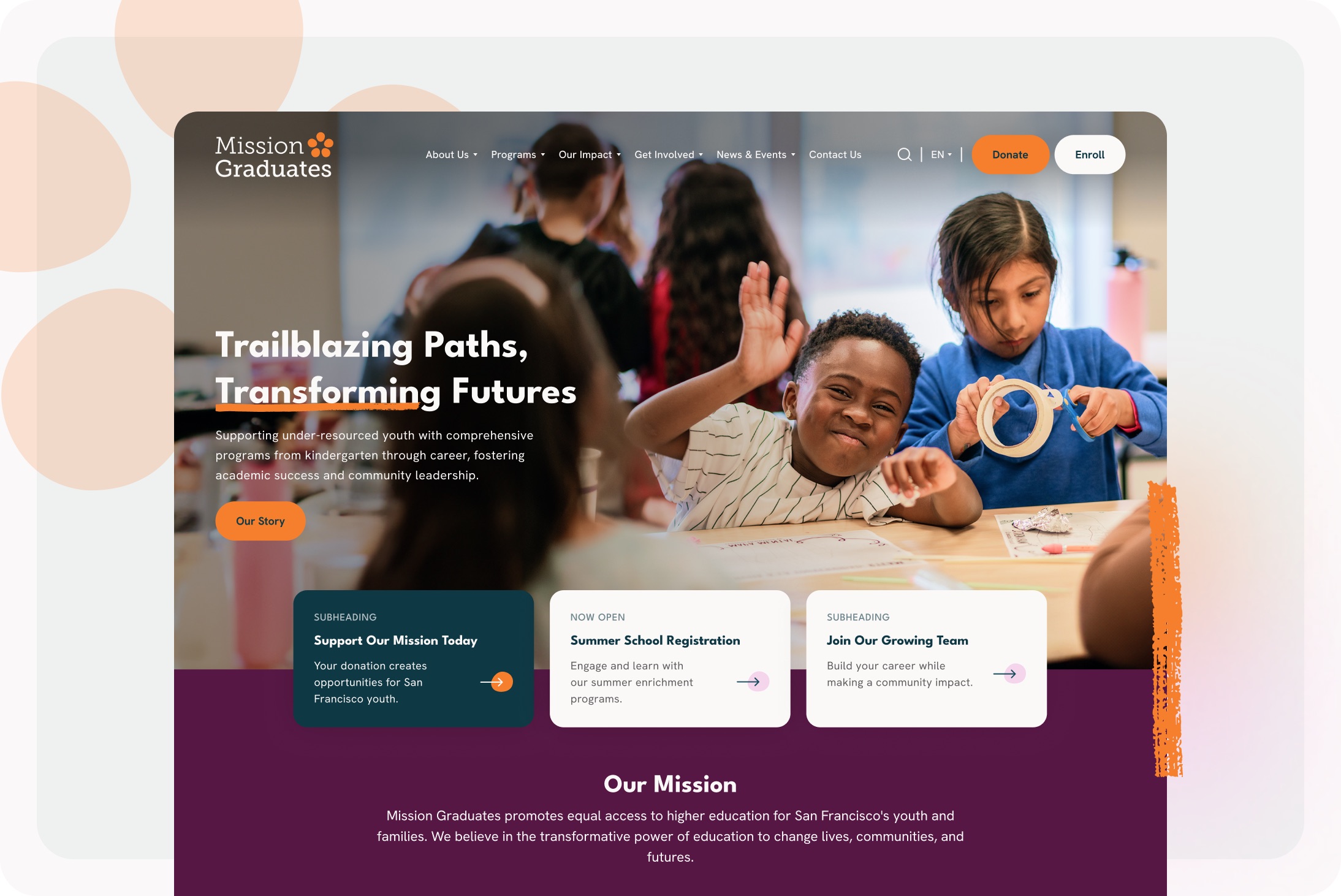
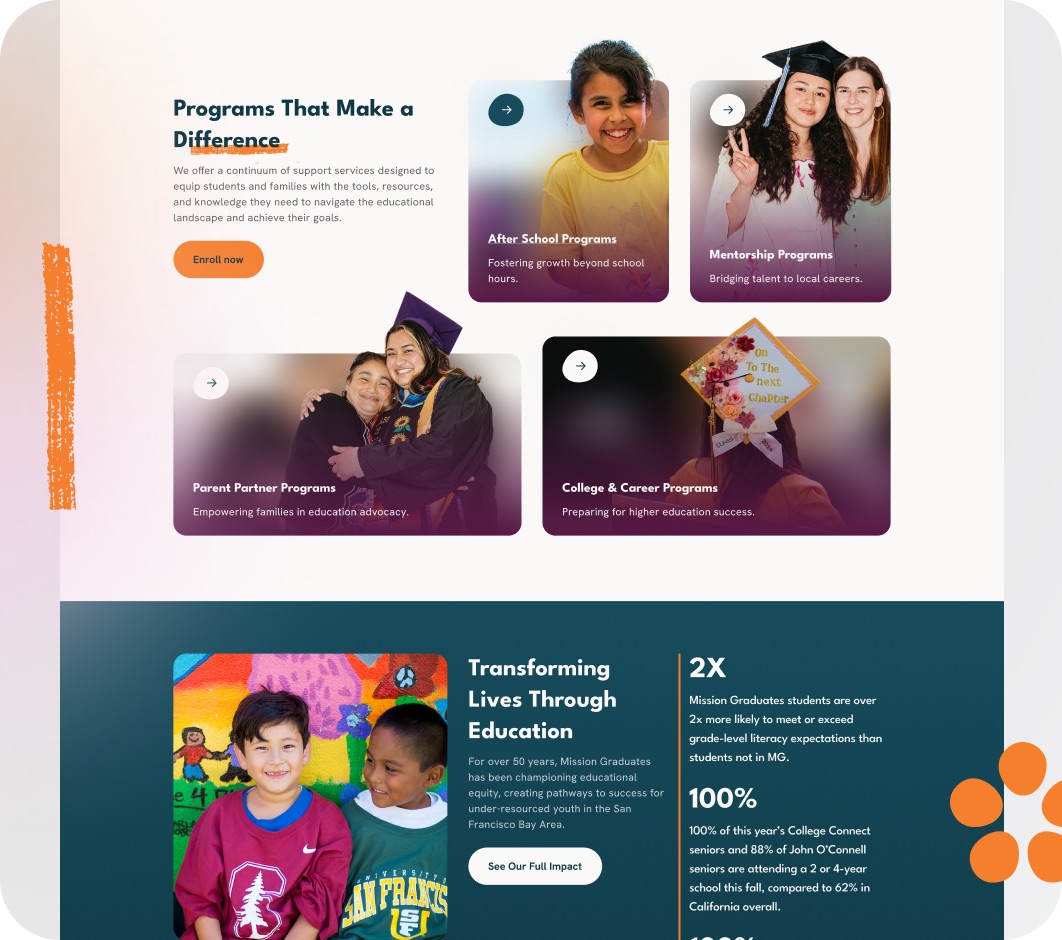
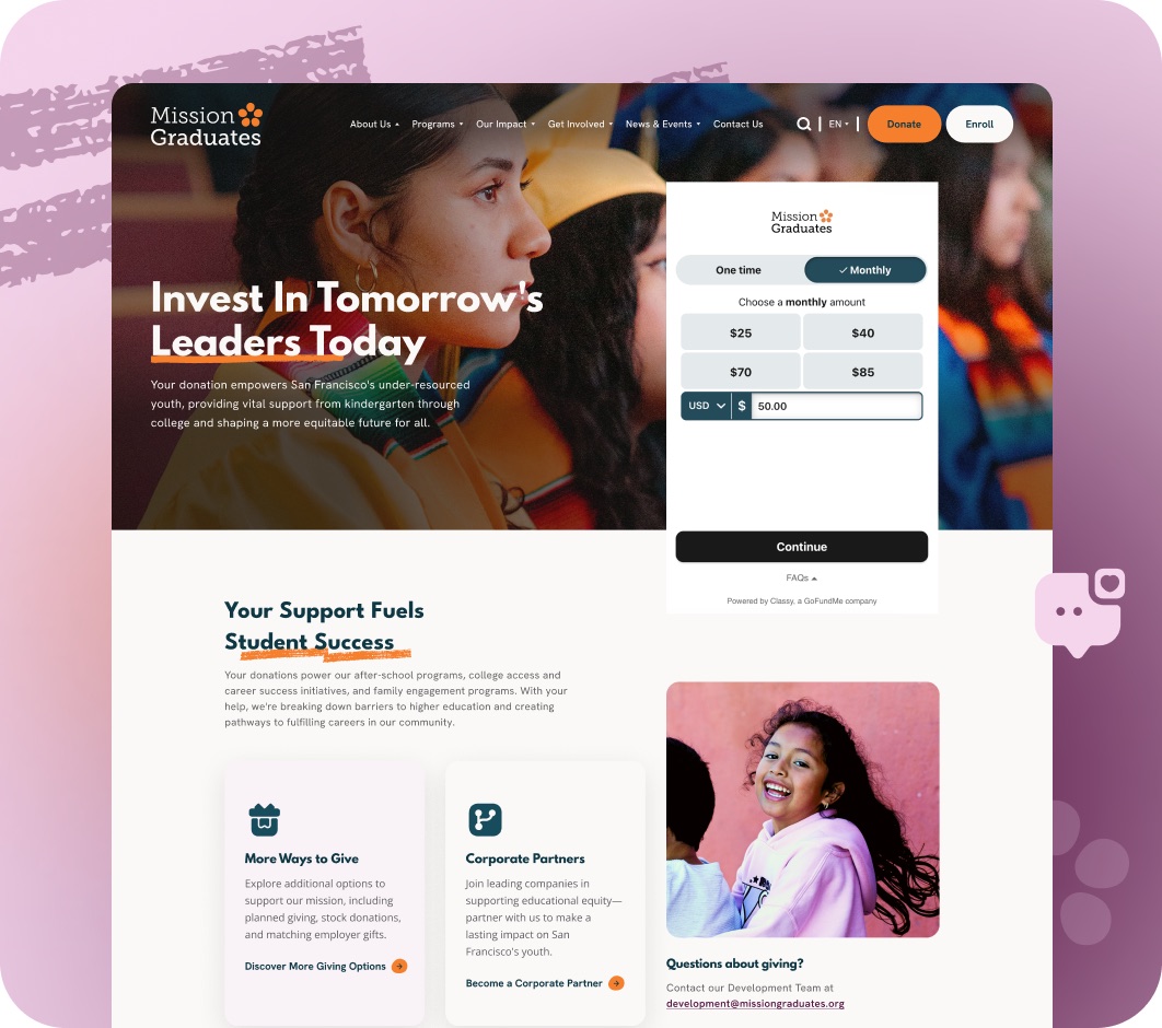
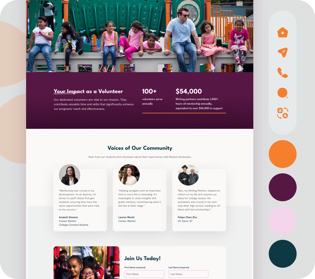
We started upstream: a Brand Strategy consultation and a consolidated Brand Style Guide to nail how Mission Graduates talks about itself (the logo stayed; the story sharpened), plus a Content Strategy roadmap and SEO copywriting to rebuild what the pages actually say. Then the site: a seven-template build architected around the priorities the team named. A dedicated Impact page finally gives the organization’s data a home; a fundraising appeal landing-page template lets the team spin up campaign-specific pages linked to their donation system; volunteer stories got room to breathe; the path to student program registration was streamlined; and a custom press blog collects the recognition a growing organization earns. Underneath it all, a re-planned information architecture replaced seven years of accretion with intentional structure.
Why It Worked
Growth without restructuring becomes clutter. Doing the brand and content strategy before the design meant the new site wasn’t a prettier version of the old sprawl — it was a different argument, organized around impact, and every template exists to advance it.
The Results
The impact story on the website for the first time — data, outcomes, and all
Campaign-ready fundraising pages replacing a single generic donor destination
Intentional architecture instead of accumulated sprawl
One consistent brand voice, documented in a style guide the whole team can use
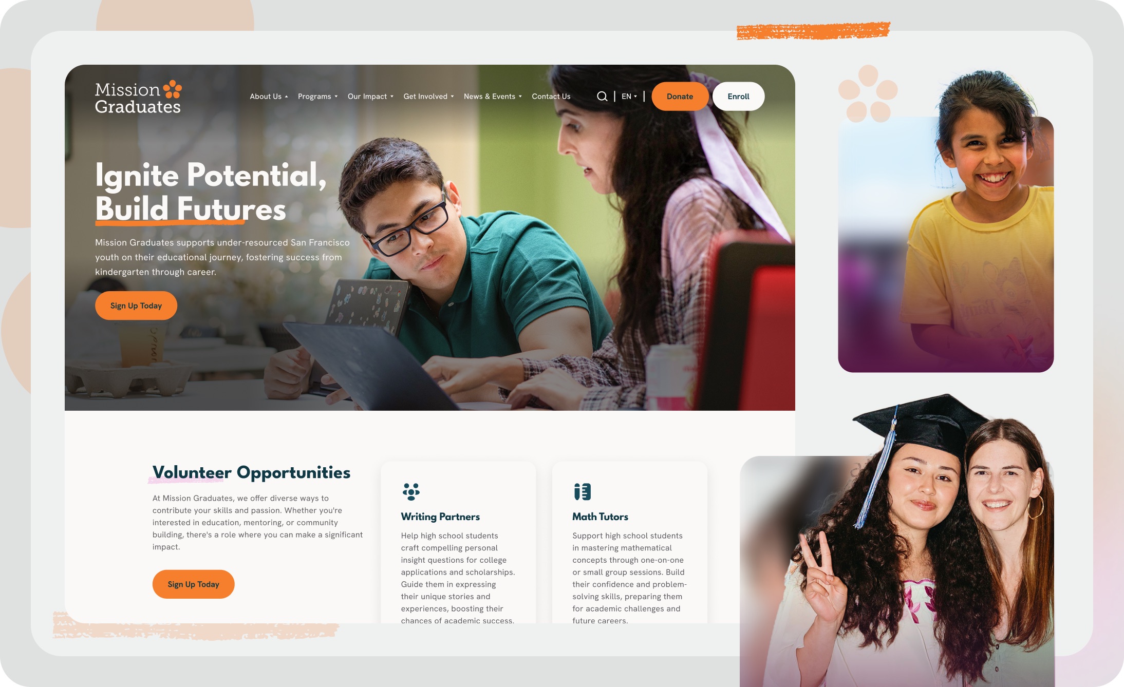
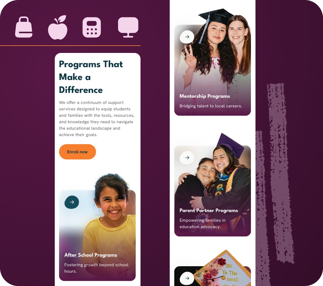
Built around the priorities the team named.
The build followed the team’s priority list: room for volunteer stories to breathe, a streamlined path to student registration, and a custom press blog that collects the recognition a growing organization earns.
Ready to put your mission in front of more people?
Tell us about your project. Our 40+ specialists know nonprofits from the inside.
Let’s talkMore Work
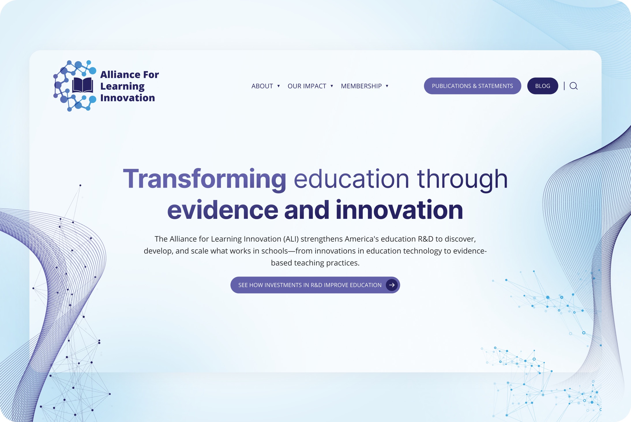 Education & YouthAlliance for Learning InnovationElevation designed a sharp, credible platform that establishes authority immediately and makes the case for action.
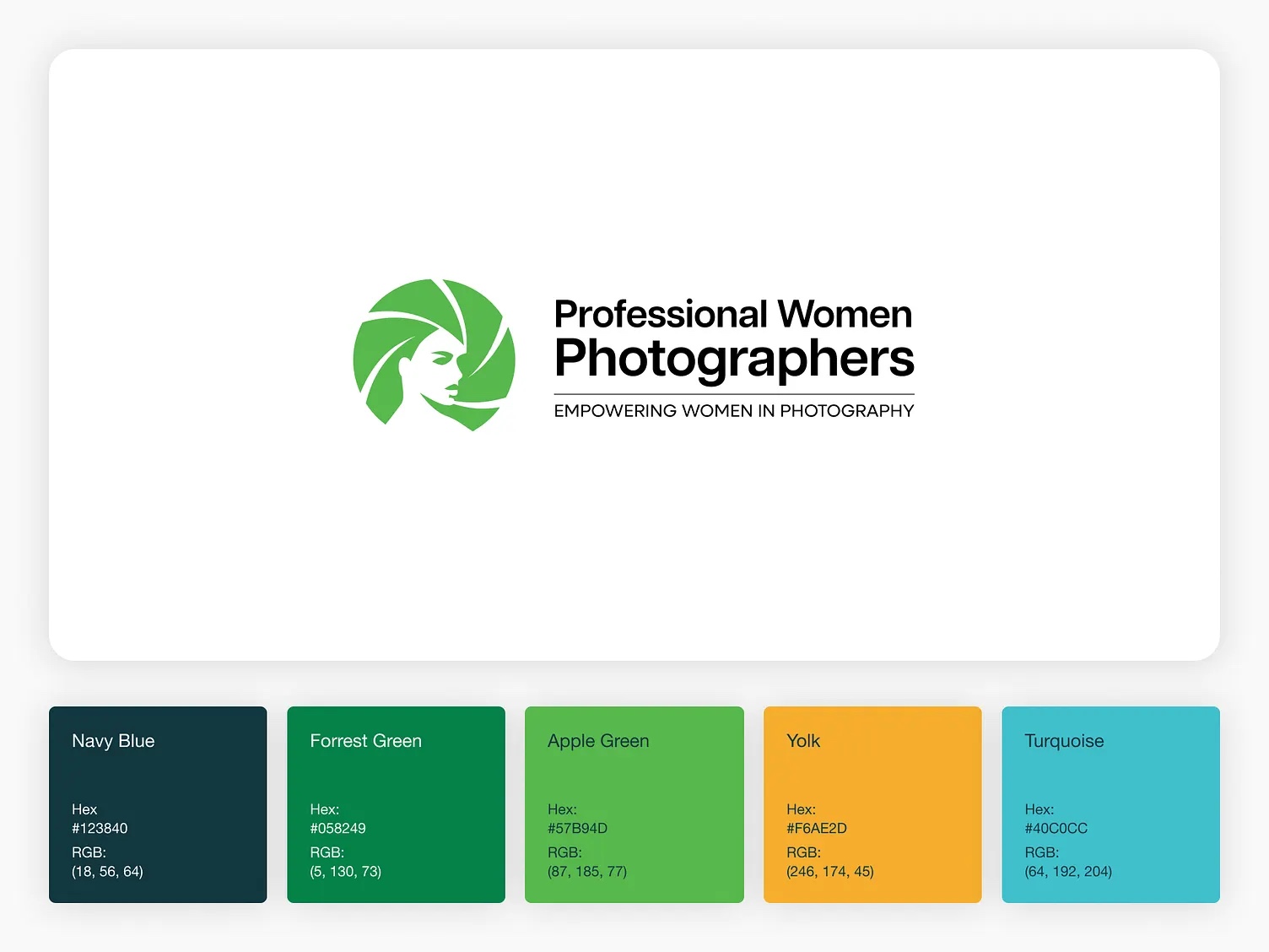 Arts & CultureProfessional Women PhotographersElevation designed a gallery-worthy website where the work shines and membership, exhibitions, and programs are easy to reach.
 Environment & ReforestationGlobal Forest GenerationElevation designed a cinematic website that makes that scale felt and translates it into action.