Clearing the clutter so the mission can build
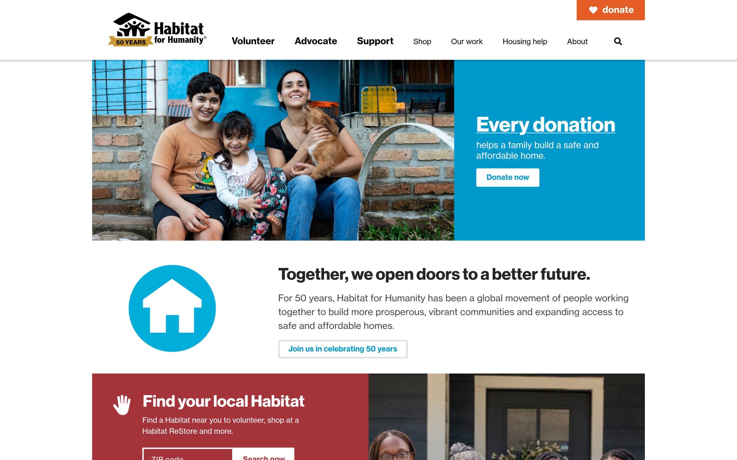
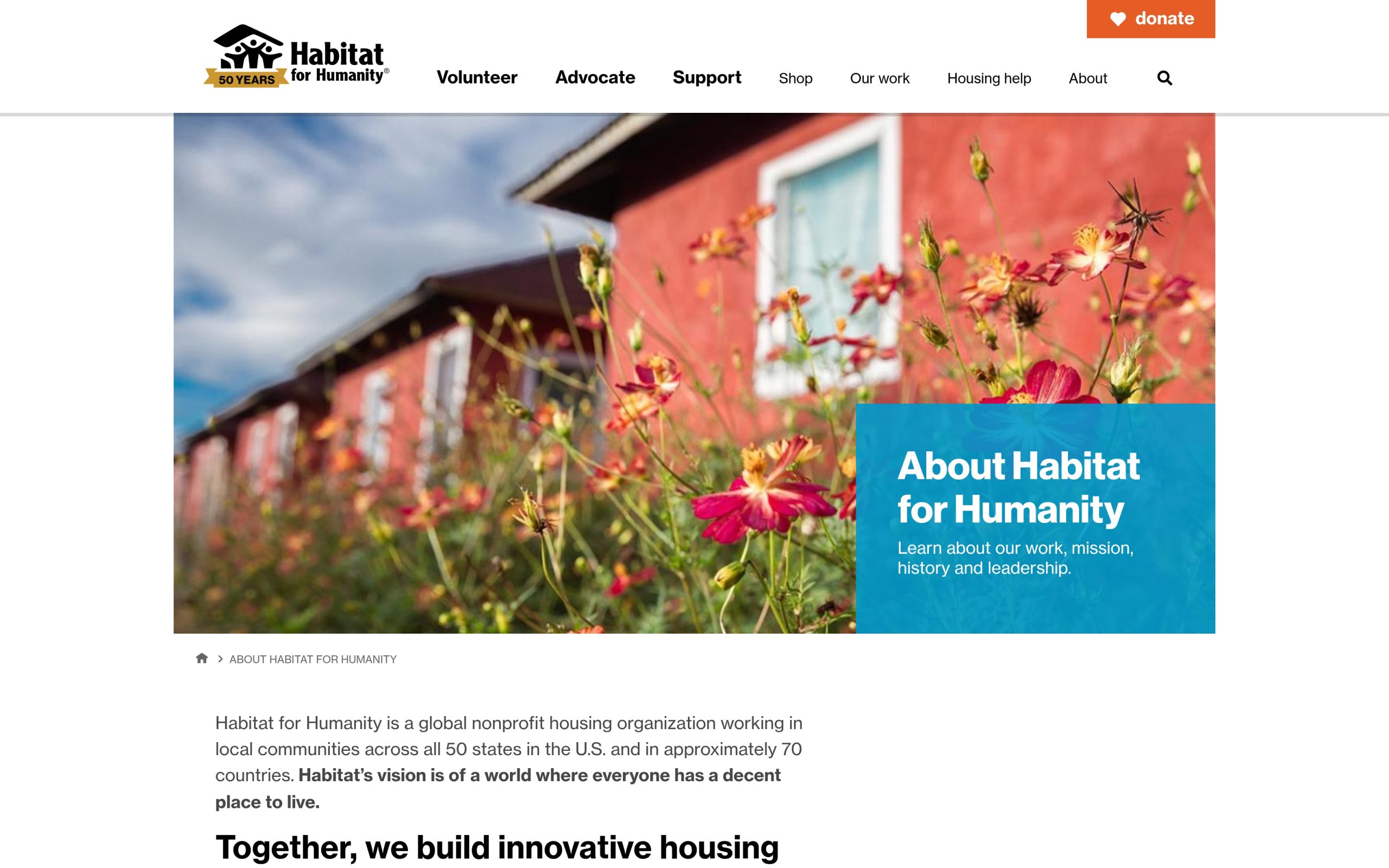
Habitat for Humanity of Lake-McHenry’s redesign replaced an old, crowded site with a clear, accessible path to donate, volunteer, and apply, with giving wired straight into Raiser’s Edge.

The story
The Challenge
The affiliate’s site had grown old and cluttered, and clutter is expensive for a Habitat affiliate: every audience that matters (future homeowners, donors, volunteers, ReStore shoppers) has a different task, and none of them could complete theirs easily. Donations, the lifeblood of the build schedule, ran through Blackbaud Raiser’s Edge with no dignified on-site experience to match.
Our Approach
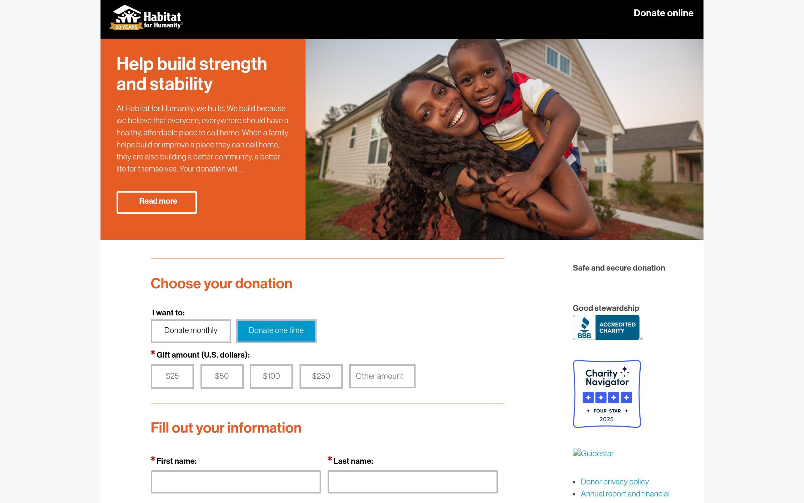
We redesigned the site around task clarity: a clean 20-page architecture where each audience finds its path in a click or two, backed by advanced site search for everything else. The donation experience got special attention: a custom-designed giving page with a styled Raiser’s Edge integration, so supporters give without leaving a branded, trustworthy flow. Accessibility tooling was built in from the start, because a housing organization’s website should be open to everyone in the community it houses.
Why It Worked
Habitat affiliates don’t need complicated websites — they need unambiguous ones. Ruthless clarity about audience tasks, plus a giving flow that honors the donor, gave Lake-McHenry a site that gets out of the mission’s way.
The Results
A clear, modern site replacing years of accumulated clutter
A custom donation experience integrated with Raiser’s Edge
Findable content through advanced search, and accessible design throughout
A platform that has since carried the affiliate through its Lake-McHenry expansion
Ready to put your mission in front of more people?
Tell us about your project. Our 40+ specialists know nonprofits from the inside.
Let’s talk